Background
When: Dec - Jan 2017Where: Evanston, IL
I was asked to redesign branding materials for a new opera company at Northwestern who wanted to appear more professional in order to cement their position as a performing arts group at the school. Their mission was to create performance opportunities for undergraduates studying opera and voice, since the existing opera program at the school frequently cast a majority of graduate students in lead roles in its productions every year. The group frequently put on new or out-of-the-box operas--for example, reimaging Mozart's The Magic Flute as a story about the invention of the lightbulb.
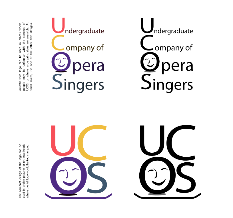
The client's existing logo did not represent their values or purpose, and did not work well in black and white print. It contained no elements that indicated that the group was an opera company, or even a performance group. In addition, they had very little design material off of which to base promotional posters or playbills.
I began the design process by brainstorming different layout designs that tried to emphasize the out-of-the-box nature of the group, as well as their musical nature. I also sampled several different fonts for the logo to choose one that fit their style. After mocking up a few of the ideas, I realized that the "out-of-the-box" focus wasn't going to work well because it wasn't readily apparently what idea the design was trying to communicate. I shifted my focus to the performance aspect of the group's work, attempting to evoke imagery related to theater and performance.

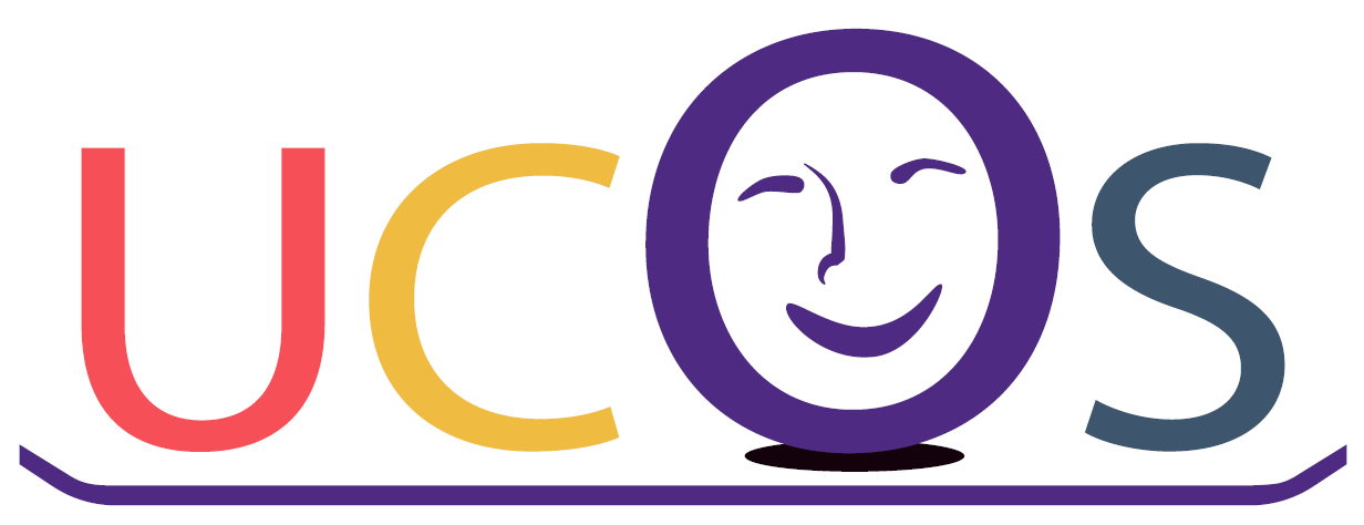
The results looked a little childish still, and the stage elements conveyed the right idea but made the logo much to complex. I stripped away everything except the baseline of the stage and decided to use a spotlight under the O to give the same idea. At the same time, I realized the colors and font needed to change in order to make the logo seem less childish. I switched out the new colors for the colors of the original logo and boldened them to give them greater impact and maturity. Finally, I swapped out the font based on customer feedback that the rounded font still made the logo look simple.
This was matched the client's expectations, so I designed several other versions of the logo for use in different circumstances and presented them in a design document detailing the decisions behind each element of the design.